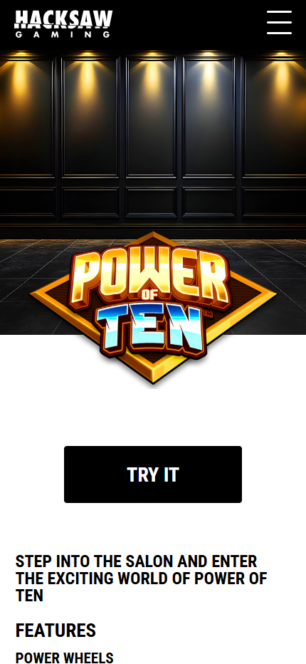
Power of Ten mobile characteristics
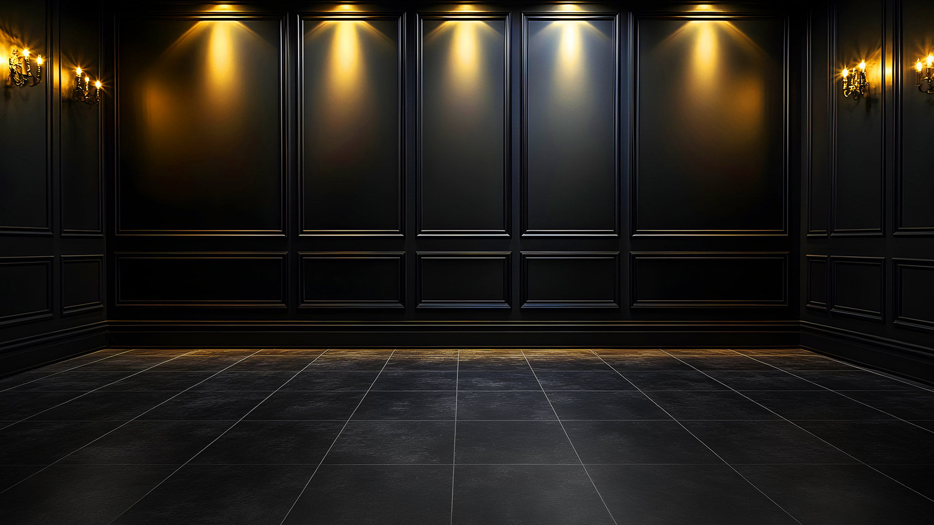
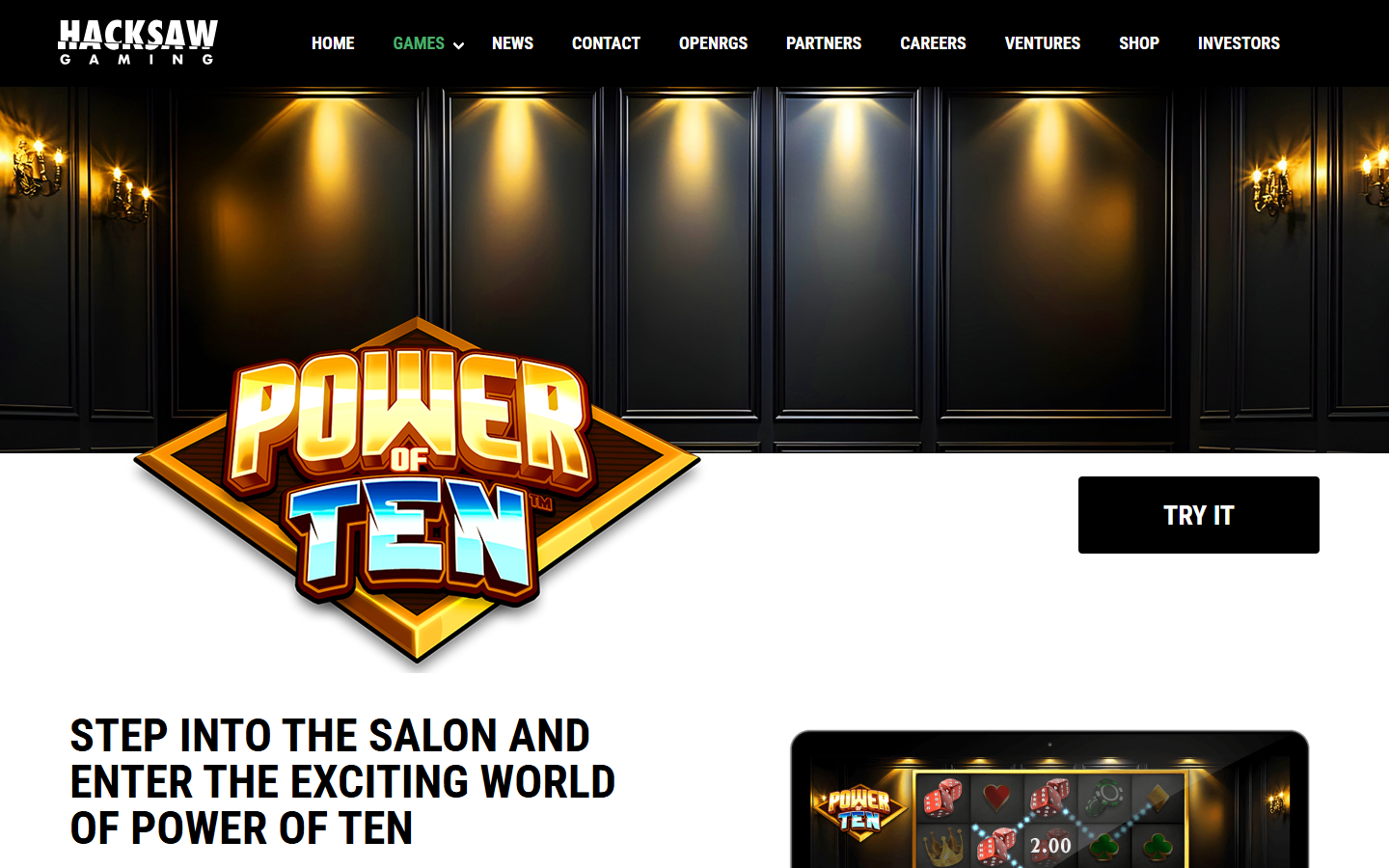
Responsive salon hero
The official mobile page places the Hacksaw Gaming navigation above a tall salon scene. Black wall panels and gold spotlights fill the upper viewport, while the Power of Ten logo overlaps the lower edge. The primary action moves beneath the artwork and remains wide enough for touch input.
Feature content follows in one column with the main salon heading and Power Wheels section. This avoids compressing text beside the game device. The design demonstrates how brand, action and product information reorder for a phone without changing the visual identity.
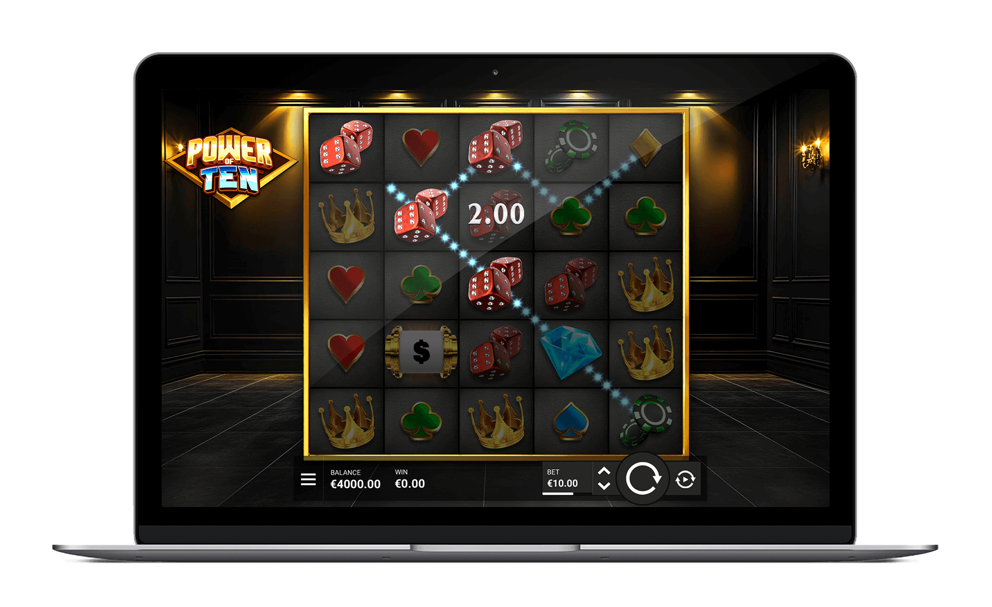
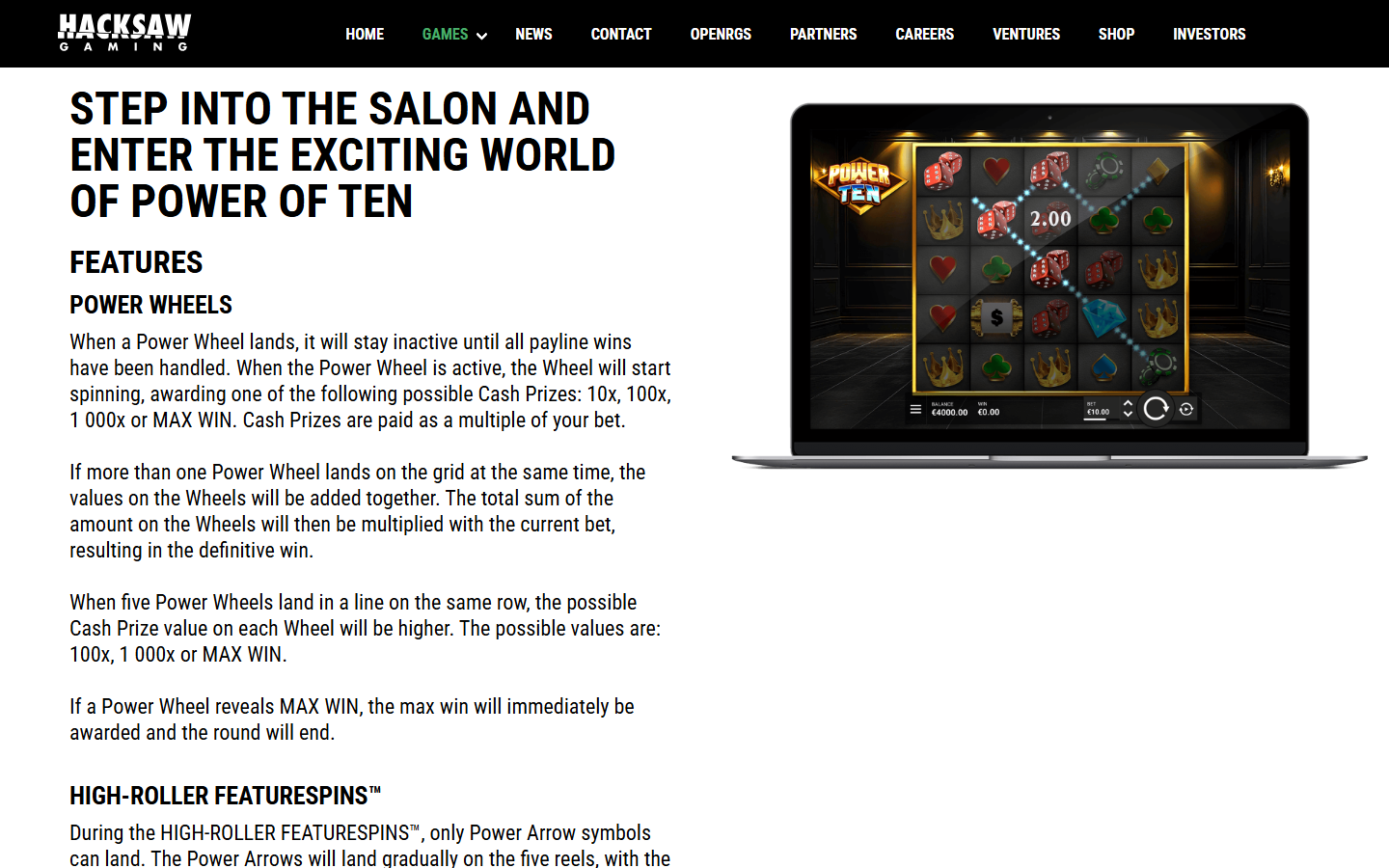
Five-reel game screen
The official device artwork shows a square five-reel grid inside the salon. On a phone, the game canvas can scale to available width while maintaining the five columns needed for full Wheel rows and the High-Roller Arrow pattern. Symbols use simple dice, suit, crown and diamond silhouettes.
Power Wheel values require large numerals, especially when several Wheels activate together. Clear cell boundaries and high contrast help the addition sequence remain readable. Counters and bet values occupy dedicated zones outside the symbol cells.
Android viewport behaviour
Android devices vary in width, aspect ratio and pixel density. A responsive game canvas can scale the salon board while keeping spin, bet and menu actions in stable touch zones. The square grid uses width efficiently on tall screens.
Bonus states add free-spin counters, refilling lives or sticky Wheels without changing the reel count. The interface can place these indicators above or below the grid according to available height. The published Cash Prize and trigger rules remain unchanged.
iPhone viewport behaviour
On iPhone screens, portrait orientation gives the logo and game board a clear central axis. Safe-area and browser chrome reduce available height, so secondary salon scenery can crop while the active grid, Wheel values and status counters remain visible.
The black, gold, orange and ice-blue palette provides strong contrast on high-density displays. Power Arrows, Wheels and FS symbols use distinct shapes, supporting recognition even when the board is rendered at compact size.
Touch controls and bonus status
The game device image places menu, balance, win, bet, spin and repeat actions along the lower edge. On touch screens these controls can increase their hit area and separate primary spin input from secondary settings. Dynamic win numbers do not need to resize the reel frame.
Deck of Fortune needs a free-spin counter, while Whopping Wheels needs a life count and sticky Wheel positions. On the House also needs to show guaranteed Wheels across every reel. The shared five-column board supports all three states.
Mobile content and image loading
Critical specifications and feature explanations on this information site are available directly in HTML. Supporting images include explicit dimensions, and non-hero assets load lazily. This reserves layout space and limits movement while a phone browser downloads the larger official artwork.
The mobile product profile remains consistent with desktop: Wheel prizes from 10x to MAX WIN, 10,000x maximum, five-reel Power Arrows and three Scatter-triggered bonus games. Layout changes presentation rather than feature meaning.